Your Pantry | UX Redesign
-
This app was originally created to help reduce food waste. The goal was a simple app that lets people select what they already have in their homes and provide them with recipes that use those ingredients. By helping people use what they already have, there is less food waste and lower grocery bills.
This was an internal project for an internship.
-
While the inspiration behind this app is noble and solves an issue many of us would like to be more conscious about, the existing interface was full of pain points and rather confusing. This lead to an app that is hard to imagine using on a regular basis.
UX Audit
Right away the app is confusing, once you are logged on there is no header reminding you of what the app is, no introduction to the interface and no clues on what to do.
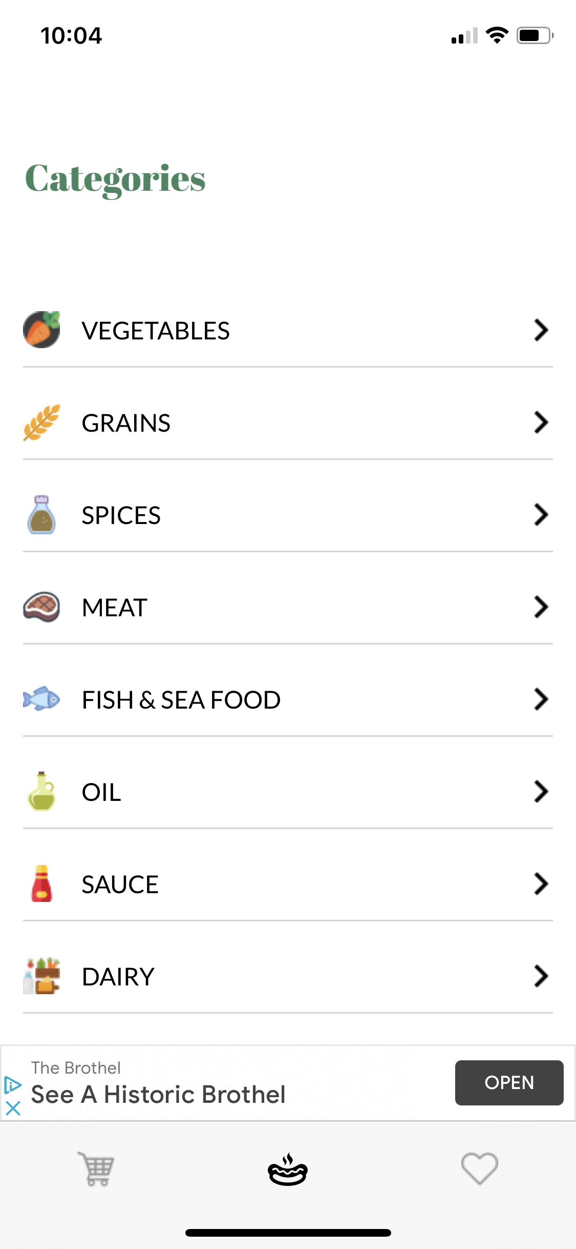
Once you explore and experiment a bit you find that the categories take you to long lists of food that you can select from. However:
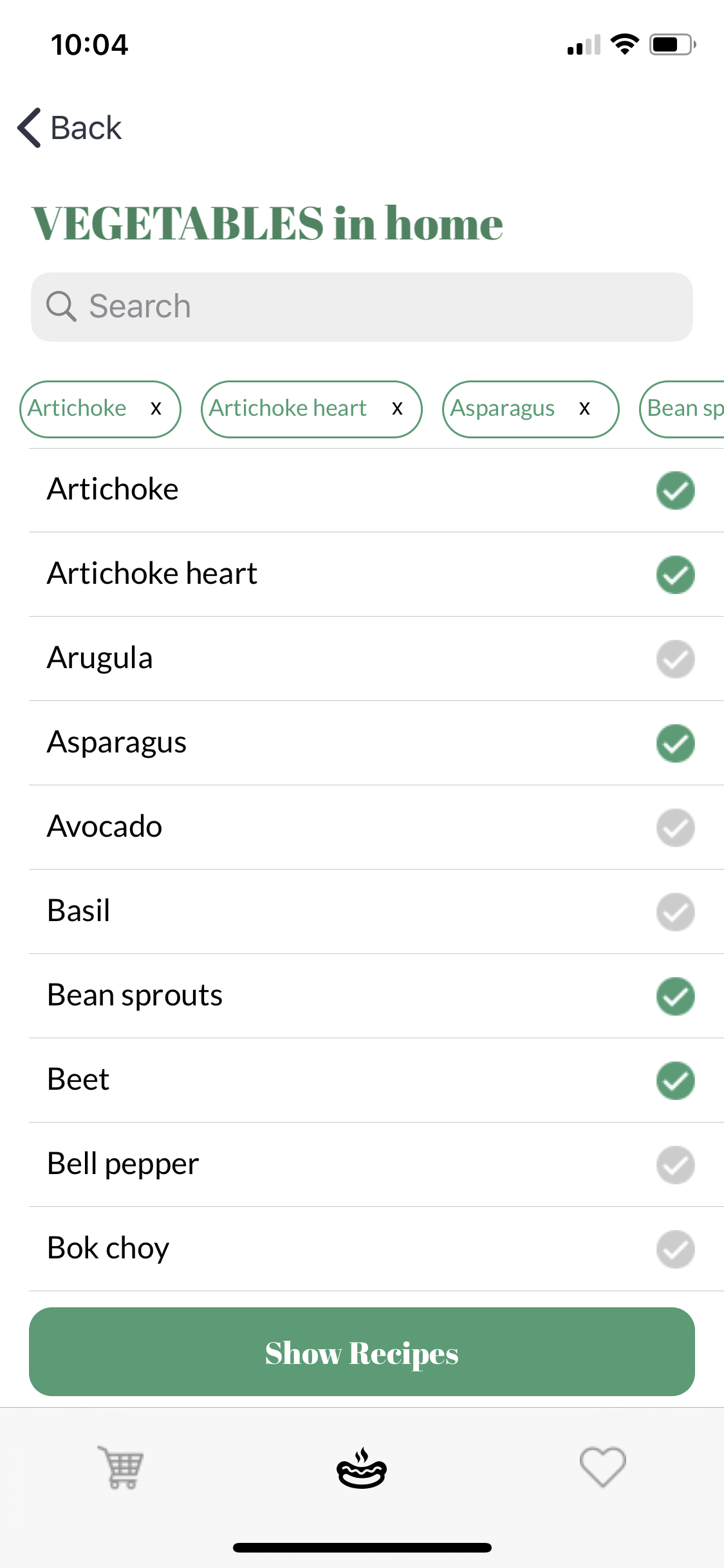
You can only search for ingredients under a specific category, not ingredients in general.
There isn’t a list of all the ingredients you have selected anywhere. You can see what you have selected in a specific category when in that category, but you can’t see a comprehensive list anywhere.
To search for recipes you have to be on one of the category pages, there is no way to progress to the next step (search for recipes that include your ingredients) from the home screen.
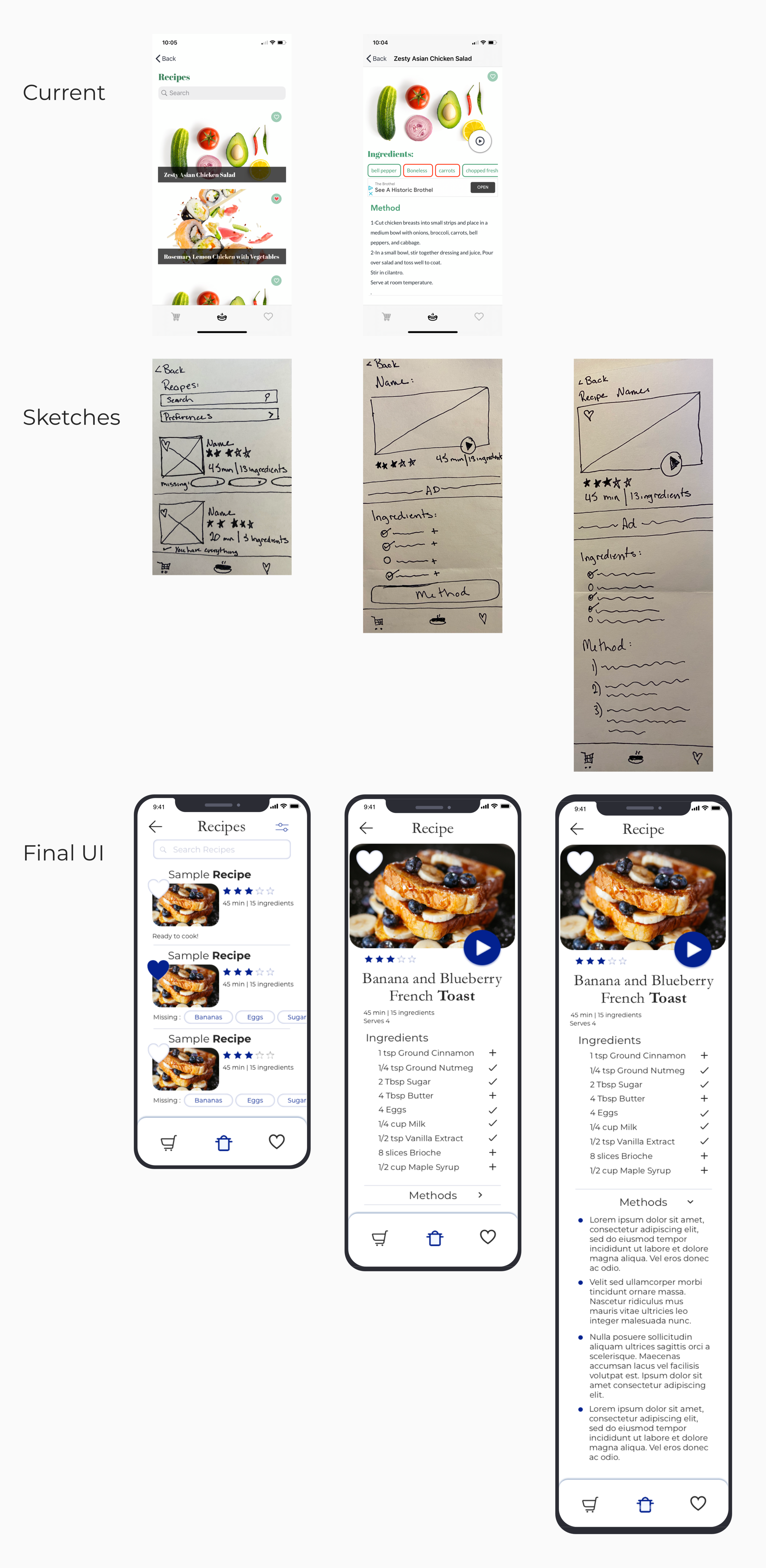
Once you search for recipes, there is no quick information about the recipes from the search results screen or even on the recipe screen itself. You have to click into the recipe then scroll through ingredients across the top and read the recipe instructions to guess difficulty, time, and number of servings.
The recipe screen has it’s own set of usability issues:
The ad placement is very close to the ingredient list, which you have to sidewise scroll through to figure out what you need, meaning that inadvertently clicking on the ad happens frequently.
The ingredient list was buggy. It didn’t reliably show the correct ingredients or color them correctly to indicate if you had that ingredient or not
Tapping an item on the ingredient list added it to your shopping cart, meaning things are very easy to accidentally added to your shopping list. Then there is no confirmation or change of state to indicate that it is now on the list.
The video play button is not immediately recognizable.
The favorite button is too small to comfortably click. It takes several attempts to click on it and leads to a lot of errors.
In addition to these big issues, and a host of UI issues, there is no place to filter your search results to accommodate for dietary needs and preferences. Or any way to export the shopping list that you made so you know what to buy at the store.
The UI Direction
After the UX audit, I sketched new flows and then created moodboards to align with my stakeholders on the direction for the stylistic change of the app.
Mood Boards
Retro Mood Board
Classic French Mood Board
Modern Mood Board
I played around with several different concepts before landing on the style inspired by classic french cookbooks. While each of the moodboards had some fun different elements, I liked the clean lines and the way the cobalt and white was fun and bright while still giving lots of room for the recipes themselves to shine. It also reminded me of Julia Childs and classic cuisine, which added a nod to the long history of cooking and cookbooks.
Style Guide
Changing the Flows
Add ingredients and search
The old flow for adding ingredients made users select a category, then would bump them to a different page where they could see a long list of ingredients that are in that category. If you wanted to search for a specific food you would have to first select the category it might be in and then type the name there. Also, you can’t see your whole list of selected ingredients anywhere and the search for recipes button is only visible within a specific category, meaning you you have to be within a category to move on to the next step.
The first fix is to change the category areas into drop down lists instead of individual pages. This allows users to add everything they have on hand more smoothly and go back to add any forgotten ingredients more easily. Also, the search for ingredients feature is now universal and can search for any ingredient, instead of only searching within a specific category.
All of the selected ingredients are also now listed across the top so users can more easily track everything they have added without having to double check individual categories and the search for recipes button is now present on all the screens so users can easily navigate to the next step in the flow.
Filtering Results
askjdflk jlkjalkjdf
Recipe Layouts
The original recipe card layout had no quick information, such as the time it may take to make a dish or the number of servings, listed anywhere, requiring you to read the whole recipe then guess.
Adding that quick access information on the recipe search results was an easy fix. Now users quickly and easily ascertain that basic information about a recipe. The missing ingredients are also now listed on the search result screen, allowing users to know if they are missing any ingredients without having to read each recipe .
The confusing ingredient list across the top is now changed to an easy to read list with amounts and clear indicators if you have an ingredient or need to add it to your shopping list.
The methods section is now a collapsible option. This allows the ingredient list to be prioritized and the methods to be more detailed without overwhelming users when they first open a recipe.
The redesigned video play button is brighter and larger attracting more attention to the video option for users who would rather be talked through a recipe instead of reading through it.
The heart button is also much more prominent so users can mark any recipes they enjoyed or want to remember for future meals.
Leaving a review
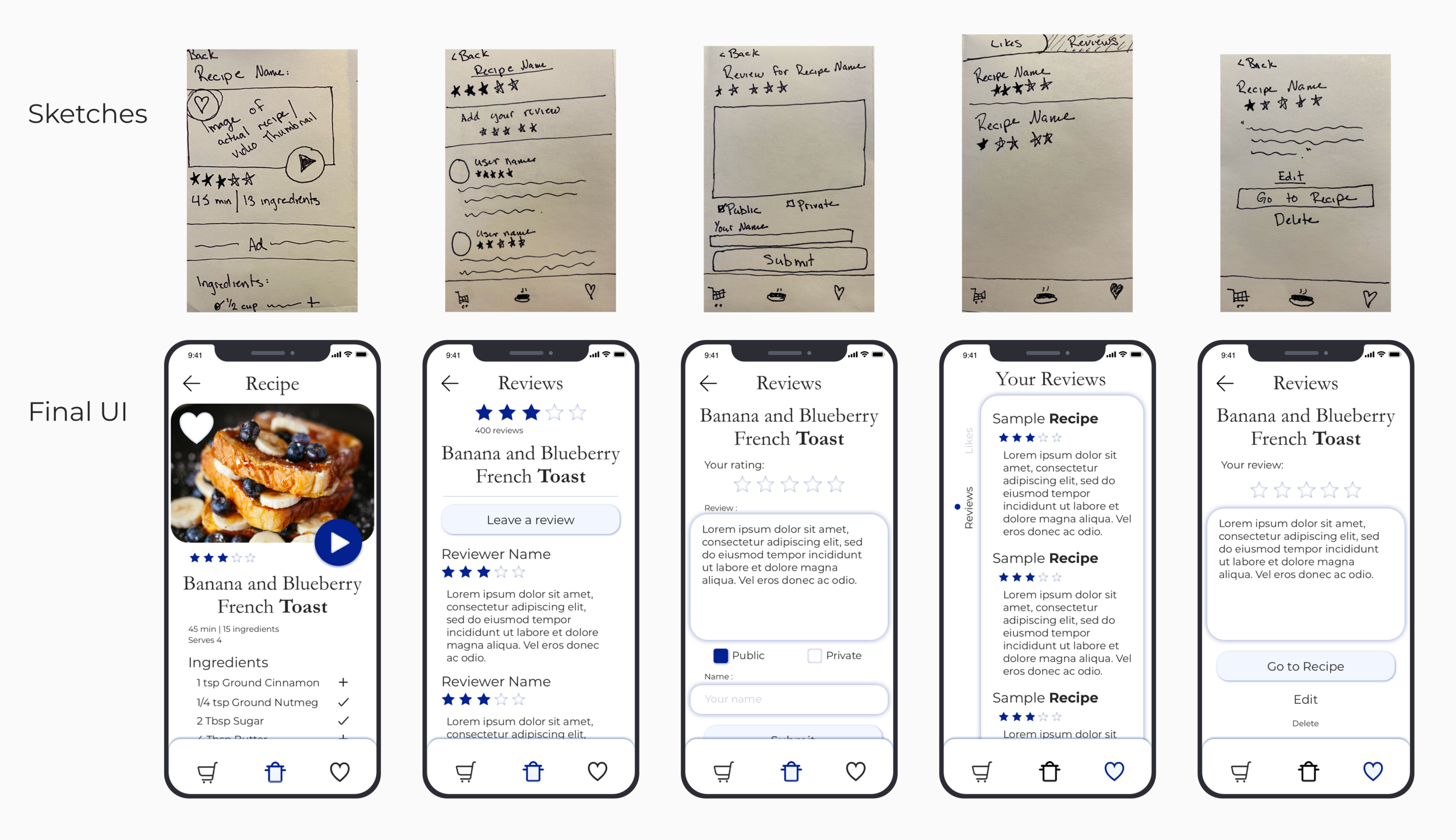
The final new flow for this redesign is giving users the ability to add a review to recipes. Many people want to be more empowered in their decision making by knowing what other people have already tried and how it went for them.
This flow allows users to read what others have written and add their own thoughts, either as a public review for all to see or as a private review which would be their way to makes notes to their future selves, much like how my mother writes comments in all of her cookbooks.
Thank you for reading through this redesign! There are no impacts to share for this redesign as it wasn’t moved into development.
Roles and Tools
UX Designer | UI Designer | Redesign | User Flows | Sitemap | Low - Mid - High-Fidelity Wireframes | Mockups | Sketch | Zeplin | Paper and Pen


